The Evolution of Digital Materials
From Skeuomorphism to Flat Design, to Neumorphism, and now Glassmorphism. What started as a niche aesthetic popularized by macOS Big Sur and Windows 11 has now cemented itself as a foundational design language for premium digital products in 2026.
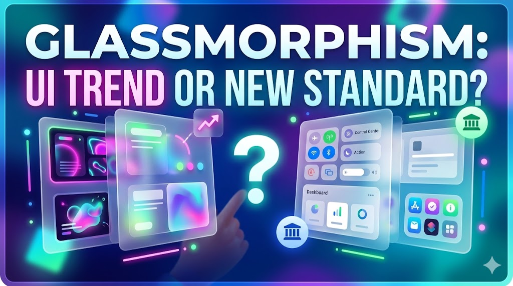
Why Glass Works
Glassmorphism isn't just about making things look pretty; it solves real UX problems regarding spatial relationships. By heavily relying on background blur (backdrop-filter) and translucent borders, designers can create a profound sense of depth and hierarchy without using harsh drop shadows or stark dividing lines.
"Translucency mimics the physical world. It tells the user exactly where an element sits in the z-index stack, establishing an intuitive mental model of the software."
The Accessibility Challenge
The biggest criticism of Glassmorphism has always been accessibility. Thin fonts on translucent backgrounds can ruin contrast ratios. To do Glassmorphism correctly, designers must follow strict rules:
- Only use glass effects on large structural elements (cards, modals, sidebars), never on primary text or buttons.
- Ensure the underlying colorful backgrounds are muted enough so that white text maintains a WCAG AAA contrast ratio.
- Always include a subtle 1px semi-transparent border to define the edge of the glass element.
When applied thoughtfully, Glassmorphism is no longer just a trend—it is the definitive look of premium, modern software.